
Client
Childlife
Childlife
Agency
Remember Pember/Click Creative
Remember Pember/Click Creative
What I did
Rebrand
New brand guidelines and key assets
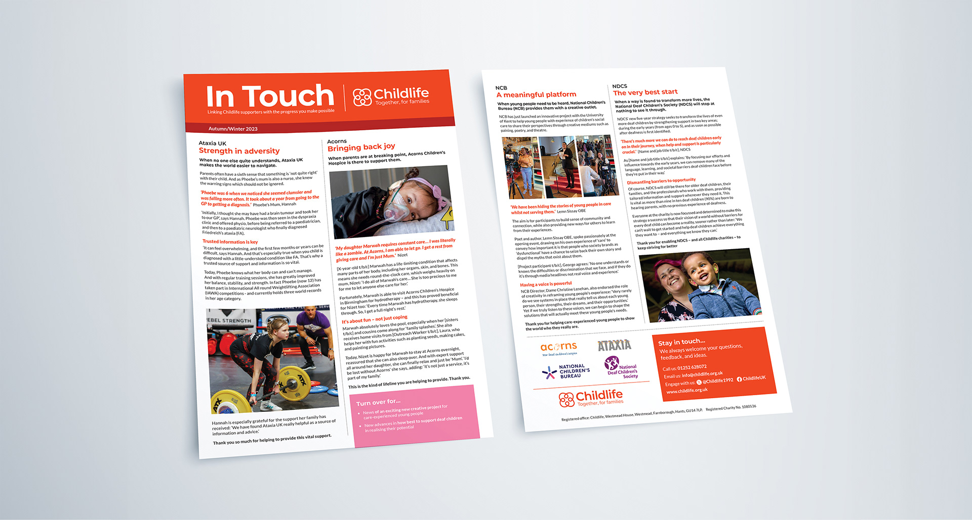
Rollout onto print and digital
Rebrand
New brand guidelines and key assets
Rollout onto print and digital
Creative team
Mark Pentney – Strategist/designer
Lisa Pember – Strategist/copywriter
Sarah Pryer – Project Manager
Mark Pentney – Strategist/designer
Lisa Pember – Strategist/copywriter
Sarah Pryer – Project Manager
Childlife is an unusual charity, in that it raises money for four other charities who each in turn support children and young people. Together with a brand consultant copywriter, we worked to create a new brand identity for Childlife and to give it a smart and coherent presence in a highly competitive marketplace.
While Childlife’s structure makes sense in the context of its history (a consortium formed to make payroll giving more affordable), the charity was struggling to make its message clear and distinctive – especially in relation to its four partner charities. Plus the brand identity was dated, confused and in dire need of a refresh.
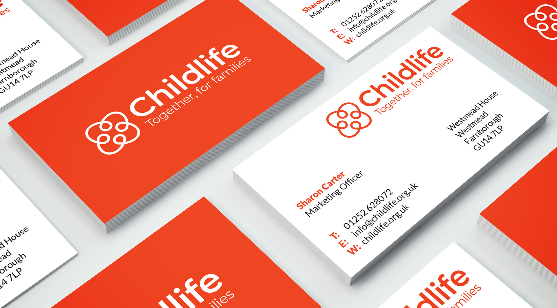
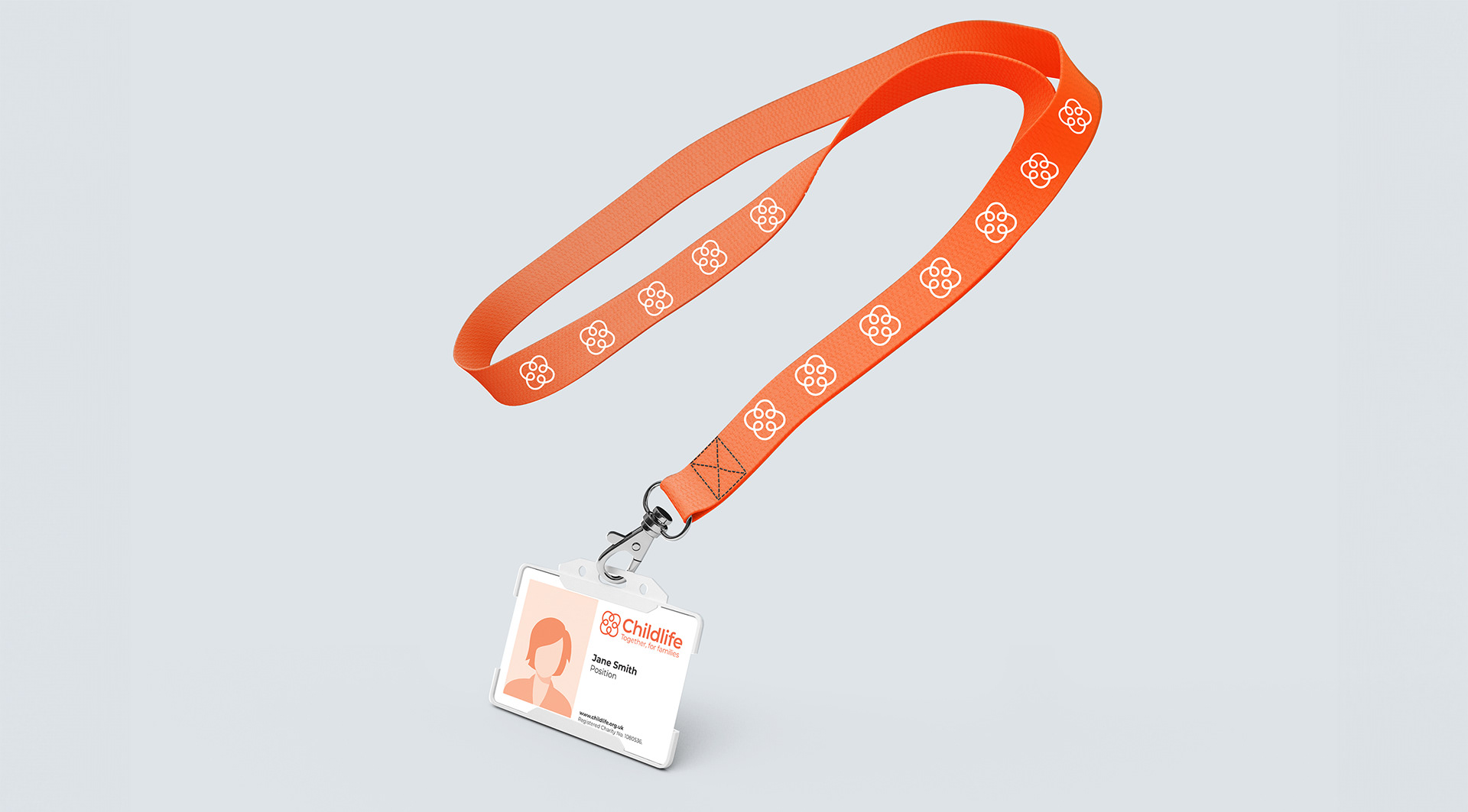
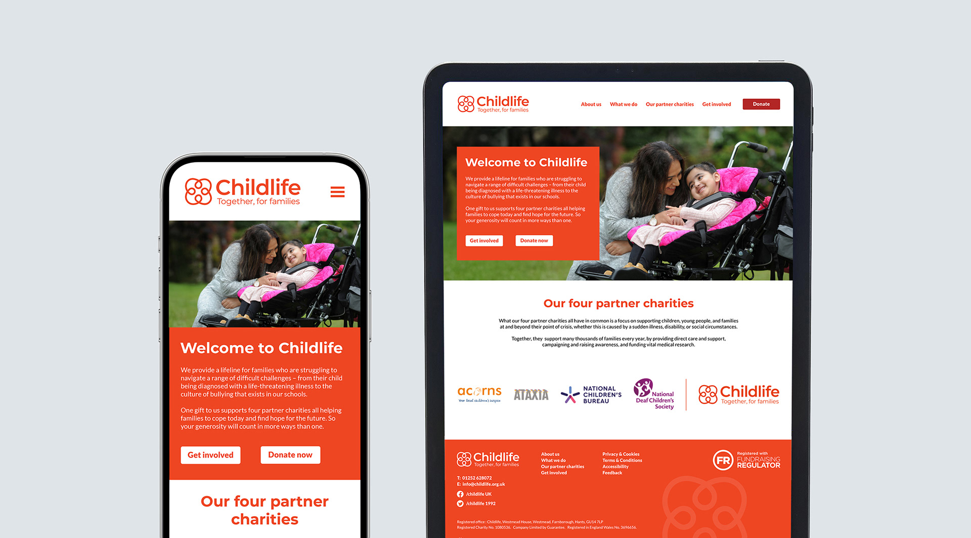
Having thoroughly explored a number of approaches with the client, we pursued the route of ‘Together, for families’. I designed a logo with four component parts, reminiscent of four heads together. This can be read as the Childlife family of charities or any family. It also has a sense of group hug or mutual support. Having chosen a strong primary colour, we developed a supporting colour palette with warmth and vibrancy.
This project was undertaken while I was Head of Design at Click Creative.



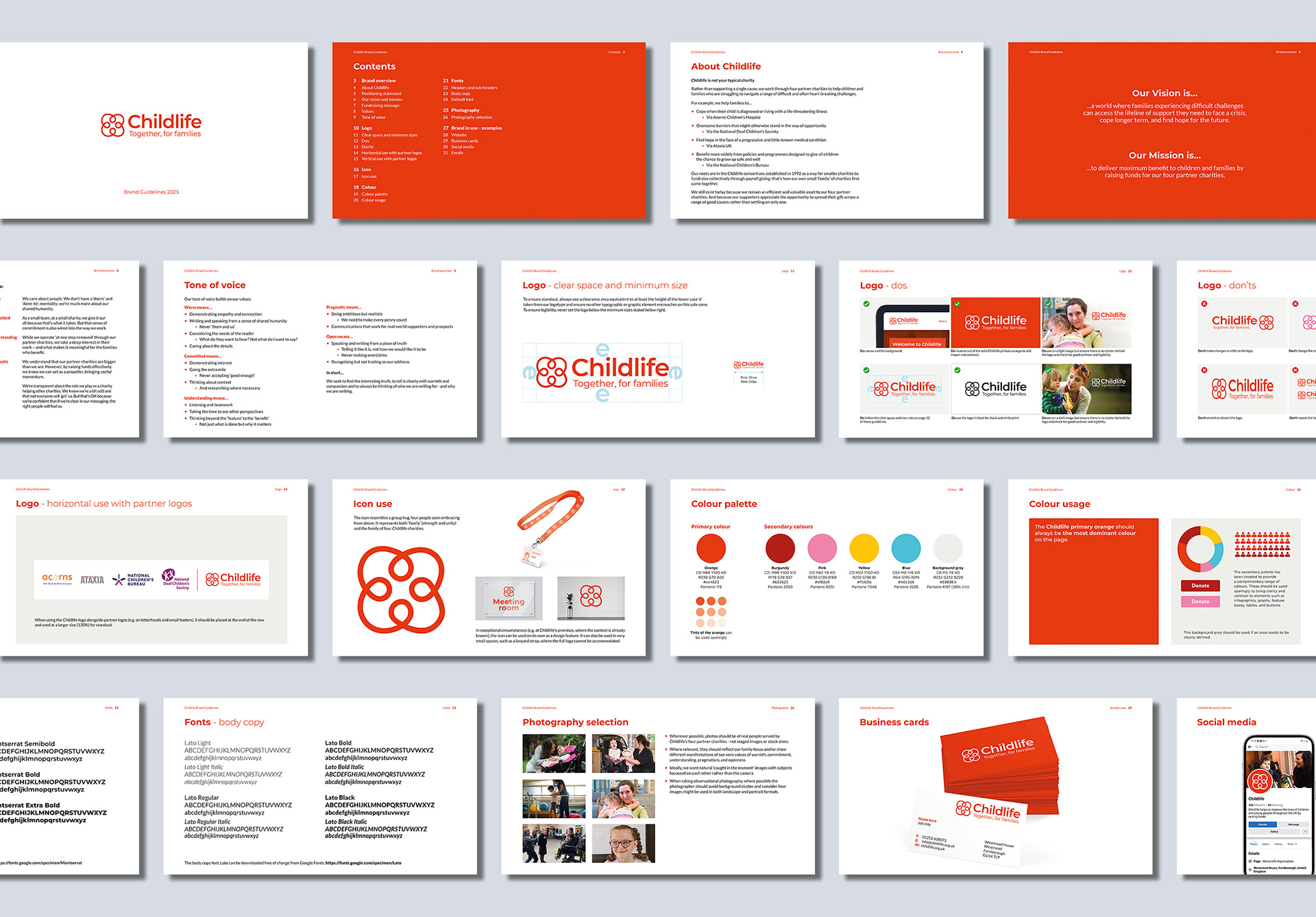
My role was to collaborate with the brand consultant copywriter throughout and once the brand positioning had been established, I lead the design on a full re-brand from concepts through to delivery. This included new brand guidelines and assets including vital direction on logo hierarchy, i.e. how to use the four partner logos alongside Childlife’s to further support understanding.
‘Safe to say we love what you’ve collectively come up with.’
Childlife client
Childlife client