Client
Church Urban Fund
Church Urban Fund
Agency
Click Creative
Click Creative
What I did
Full advent campaign and branding
Core direct mail pack and reminder pack
Cold inserts
Print and digital advertising
Social media assets
Website and digital assets
Full advent campaign and branding
Core direct mail pack and reminder pack
Cold inserts
Print and digital advertising
Social media assets
Website and digital assets
Creative team
Mark Pentney – Designer
Lisa Pember – Copywriter
Sarah Pryer – Project Manager
Mark Pentney – Designer
Lisa Pember – Copywriter
Sarah Pryer – Project Manager
We were approached by a former client who had moved into a new role and who needed to turn around a complete Advent campaign, for warm and cold audiences, within a very limited timeframe. She came to us, not only as ‘a safe pair of hands’, but with knowledge that we would bring insight and creativity to the task.
Logo and campaign identity
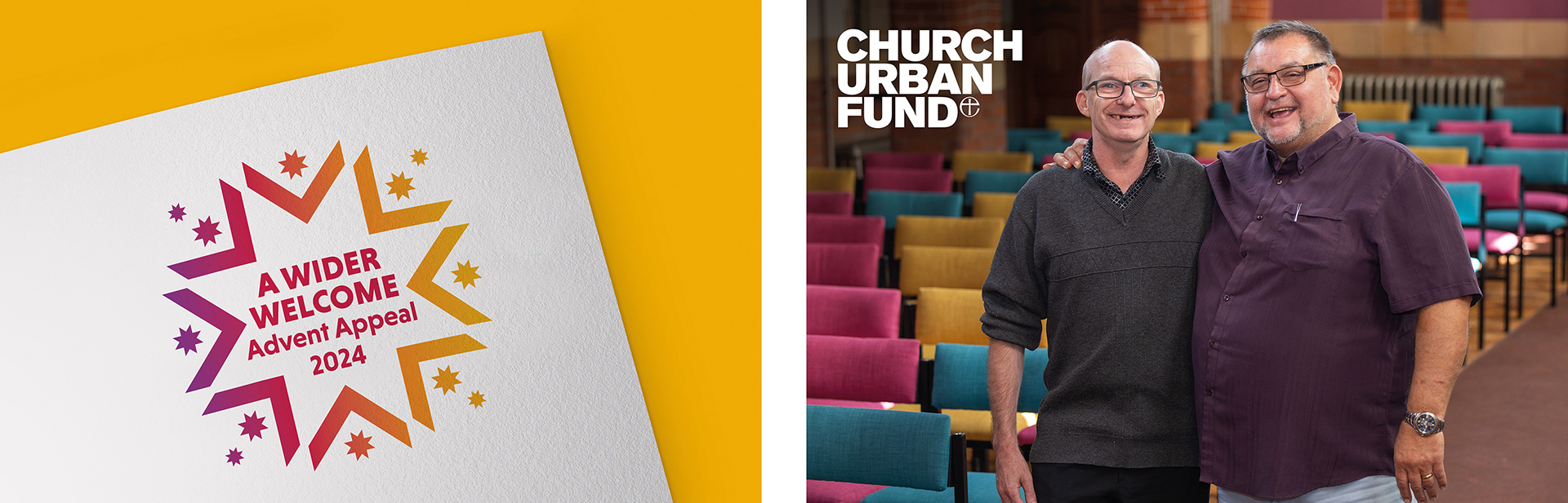
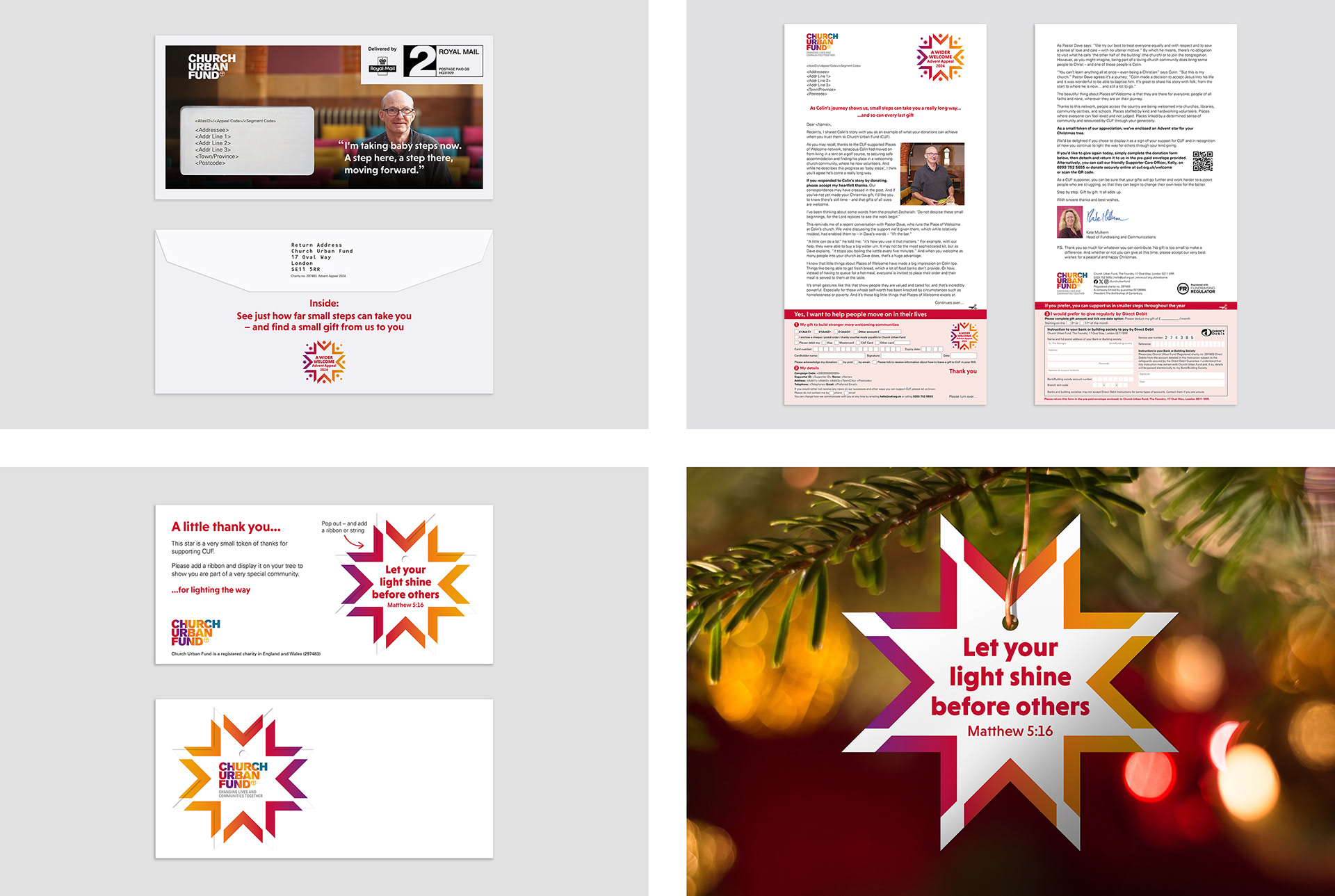
The chosen ‘A Wider Welcome’ appeal name successfully echoes the Places of Welcome service that supported Colin, our hero case study. We then developed a shortlist of three logo designs, settling on a star, which represents both a source of light and the themes of good news and guidance that are central to the Nativity story. The inward pointing arrows welcome everyone in, while the radiating stars hint at snowflakes; apt for Colin’s story, given his experience of being homeless through winter.
Core DM pack
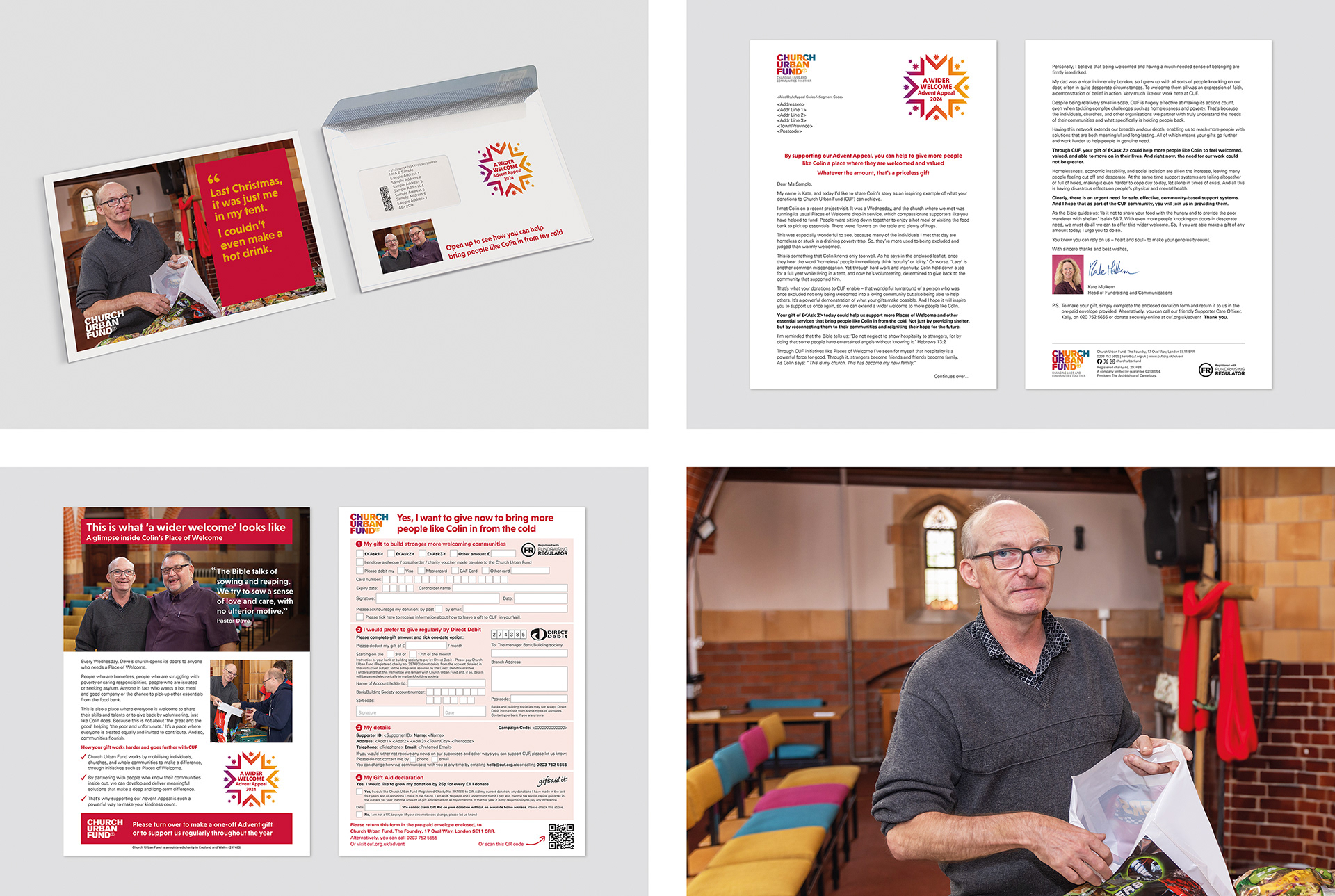
Telling Colin’s story engagingly and respectfully was vital. This started with the photography brief; to show Colin as having agency and great connections with other people, such as Pastor Dave, who is also featured.
Reminder pack
In the reminder pack, we picked up Colin’s progress and shifted the emphasis more towards the donor and their role in such success stories. The enclosed tree decoration, featuring a version of the star lifted from the campaign logo, recognises the donor as a shining example.
Small-space digital and print ads
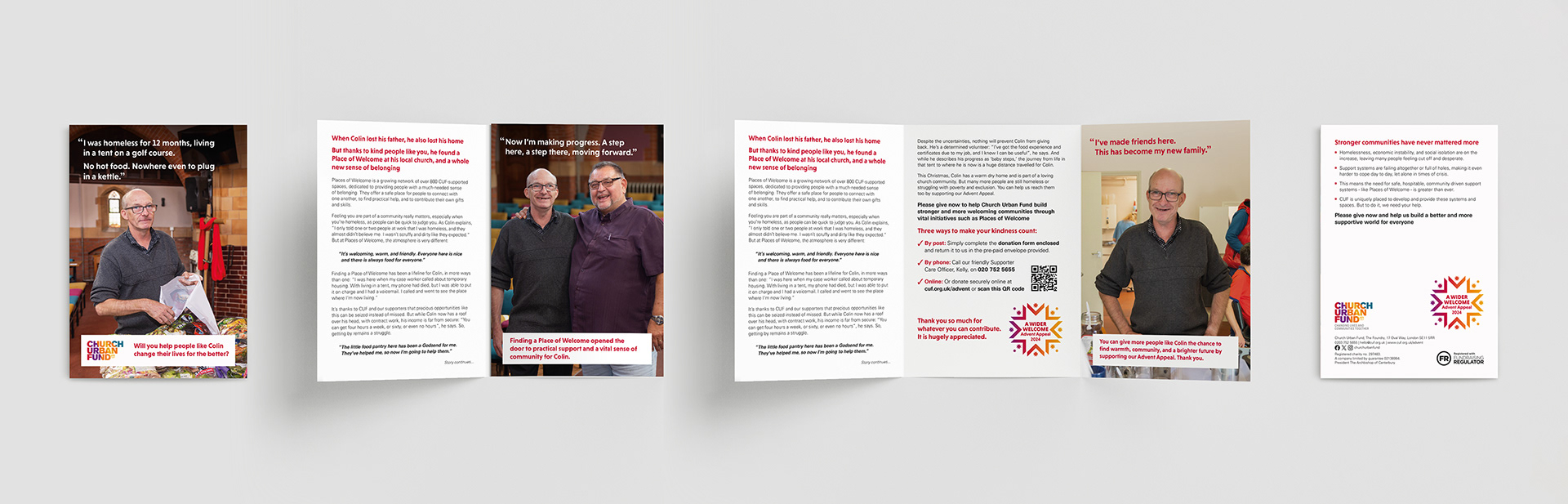
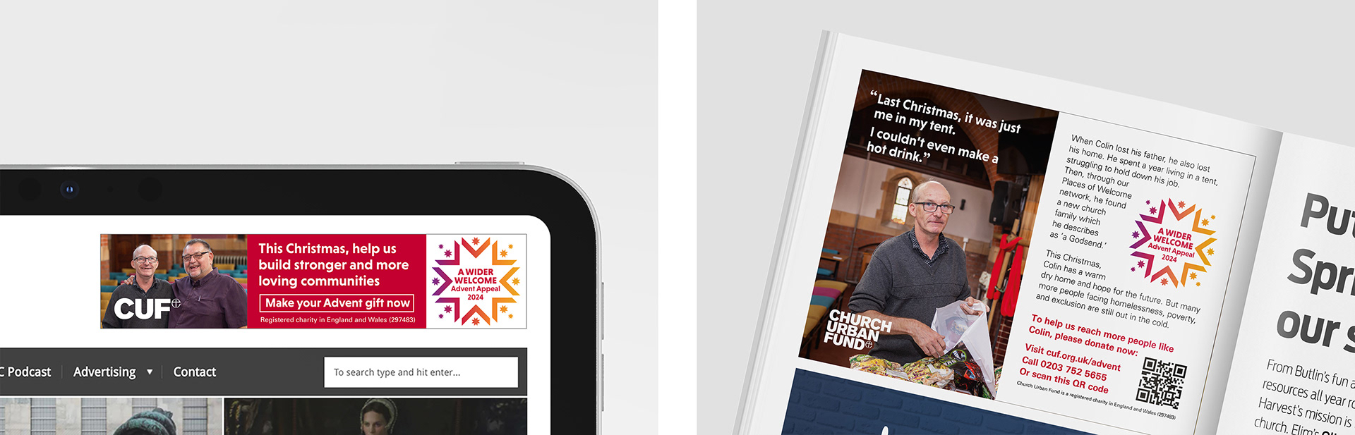
The logo was purposefully designed to integrate both words and graphics, so that it would retain its impact in small space print and digital ads. Colin remains front and centre, and where possible, his own words feature prominently.
Christmas Appeal 2025
The Christmas Appeal for 2024 was such a success that we were brought back to deliver the 2025 campaign. Consistently achieving strong results and retaining clients has been a key factor in my success during my 11 years at Click Creative.
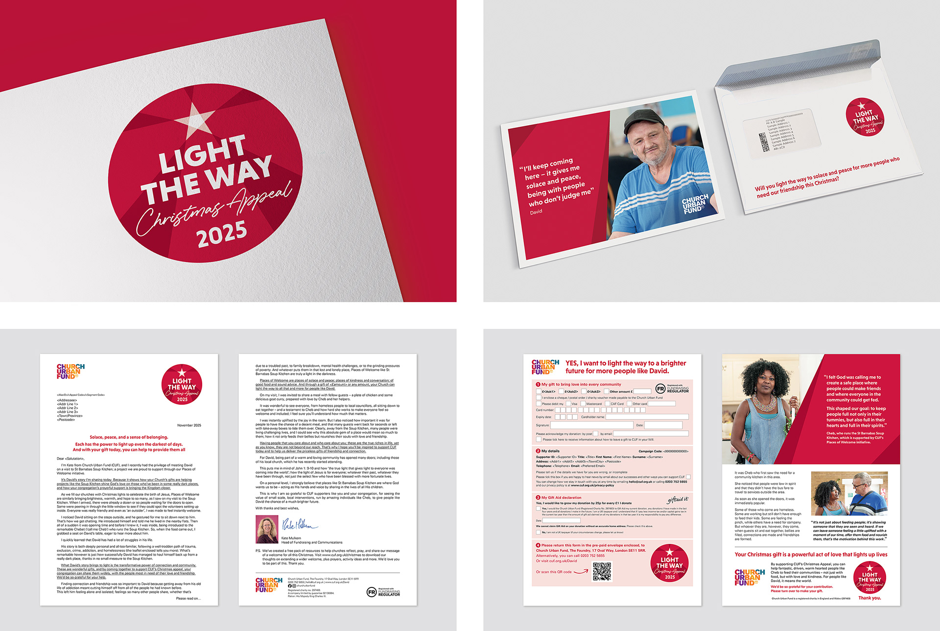
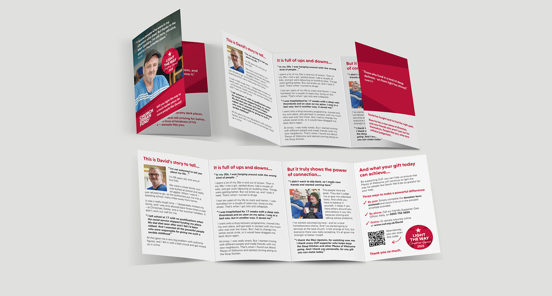
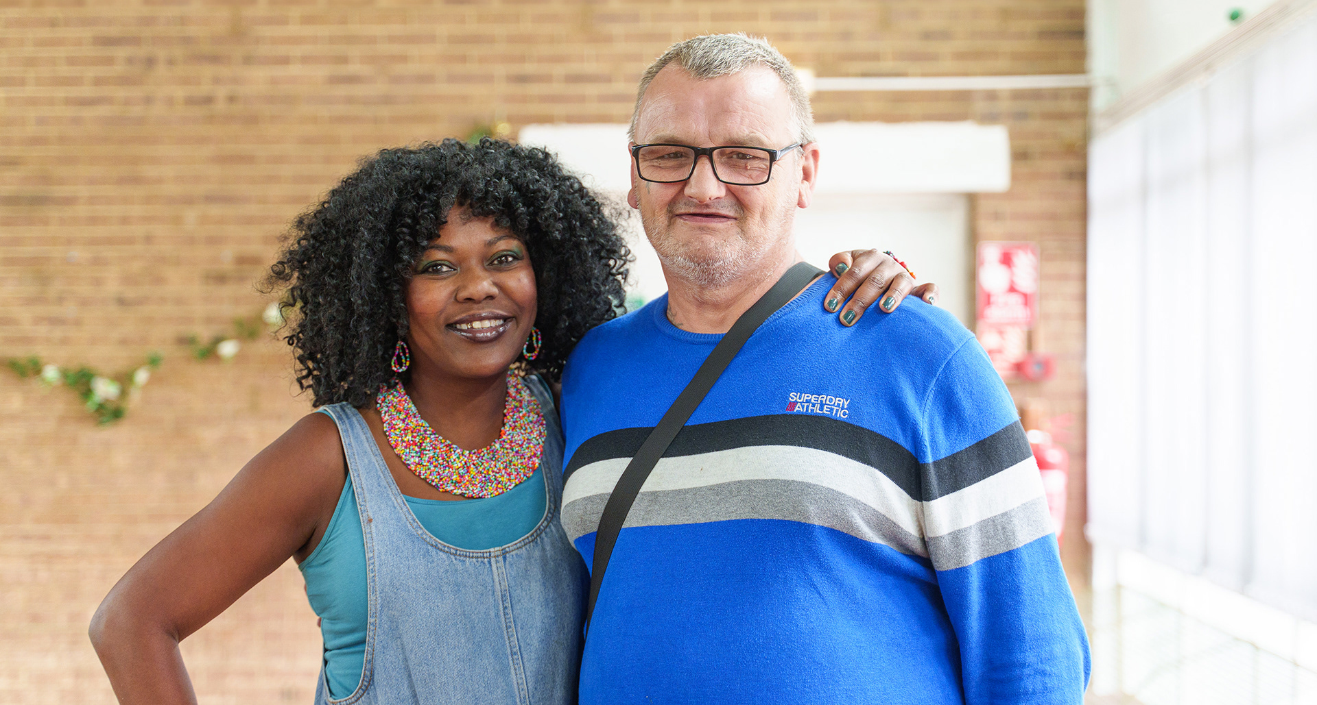
The new ‘Light the way’ campaign for 2025 continued the Church Urban Fund work around ‘Places of Welcome’ including over 900 venues across the UK. Acting as a beacon of hope to lighten the darkest of days for people like David to meet at a place where he is not judged and welcomed in. The new campaign identity strongly aligned with the Christmas theme with rays of light illuminating from a central star.
The final identity was designed with intent to further improve on the previous campaign, to create a mark that works well across all channels even in the smallest of spaces, with multiple components and overlaid onto background imagery.
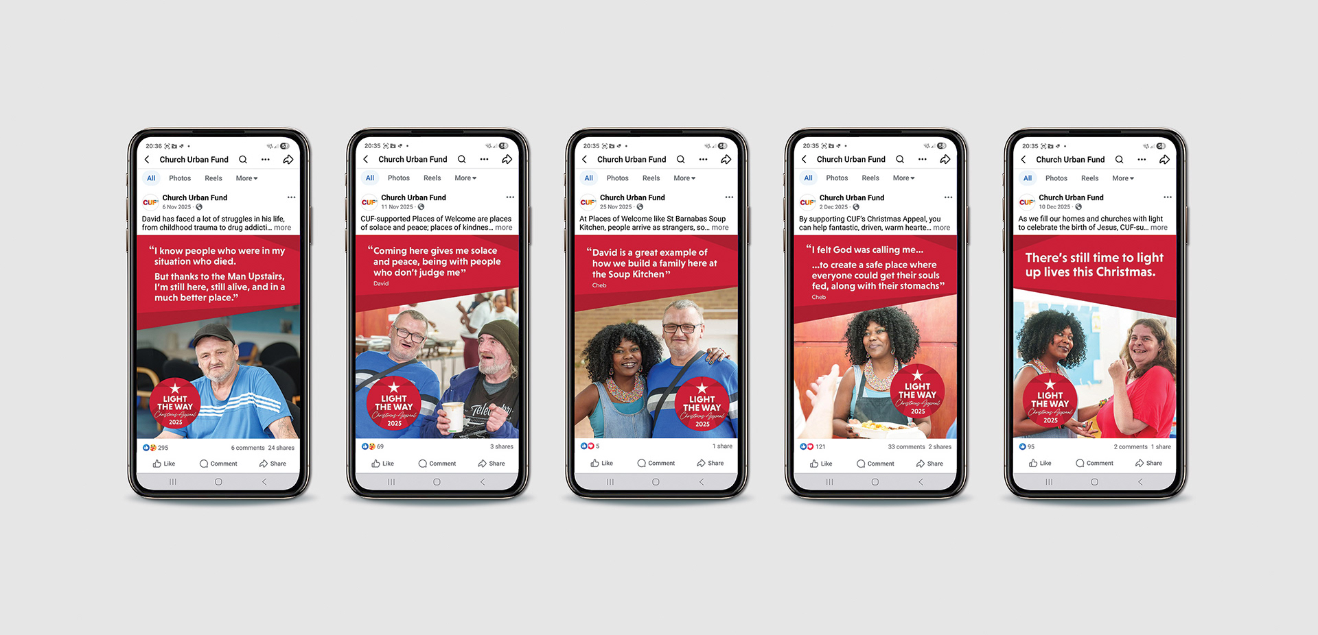
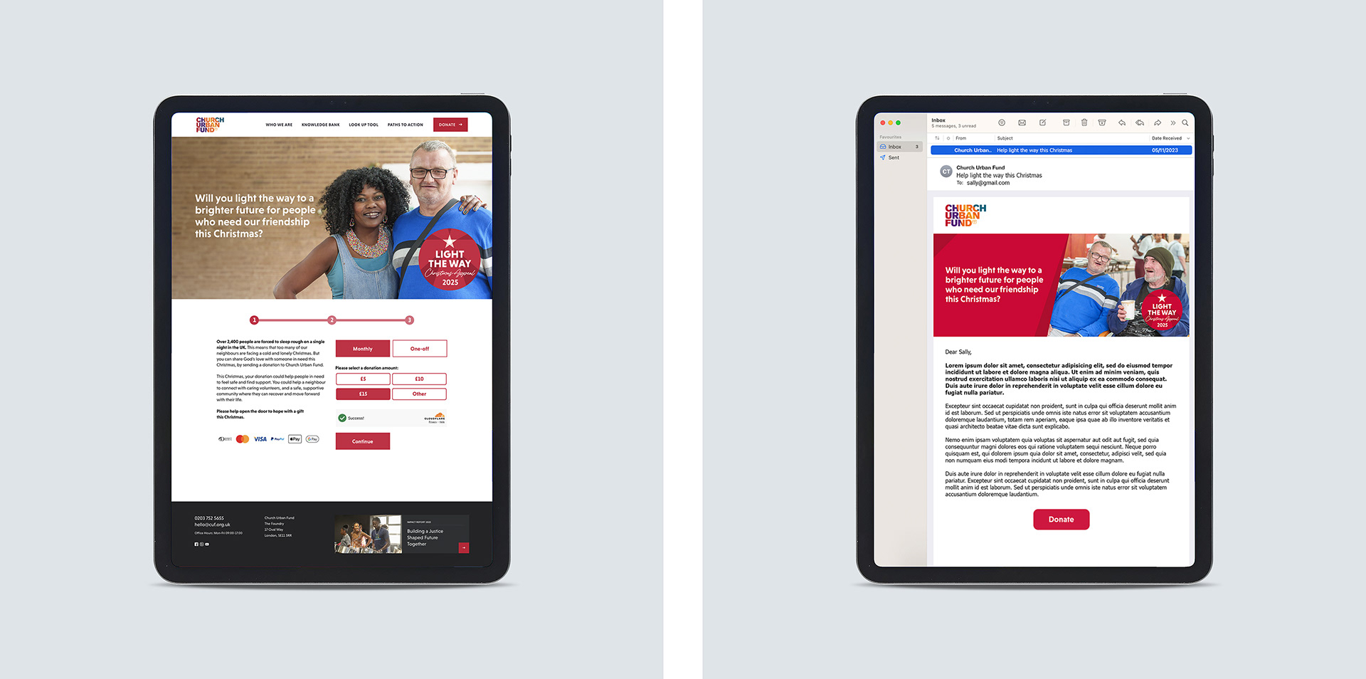
The warm appeal campaign was again rolled out onto the core dm appeal and multiple channels including small space print and digital adverts, a social media campaign, and web and email marketing assets.
Having met all targets, they subsequently returned to us to deliver their Advent campaigns in 2025 and 2026, which I see as a strong reflection of both the quality of the work and the trust we had built throughout the project.